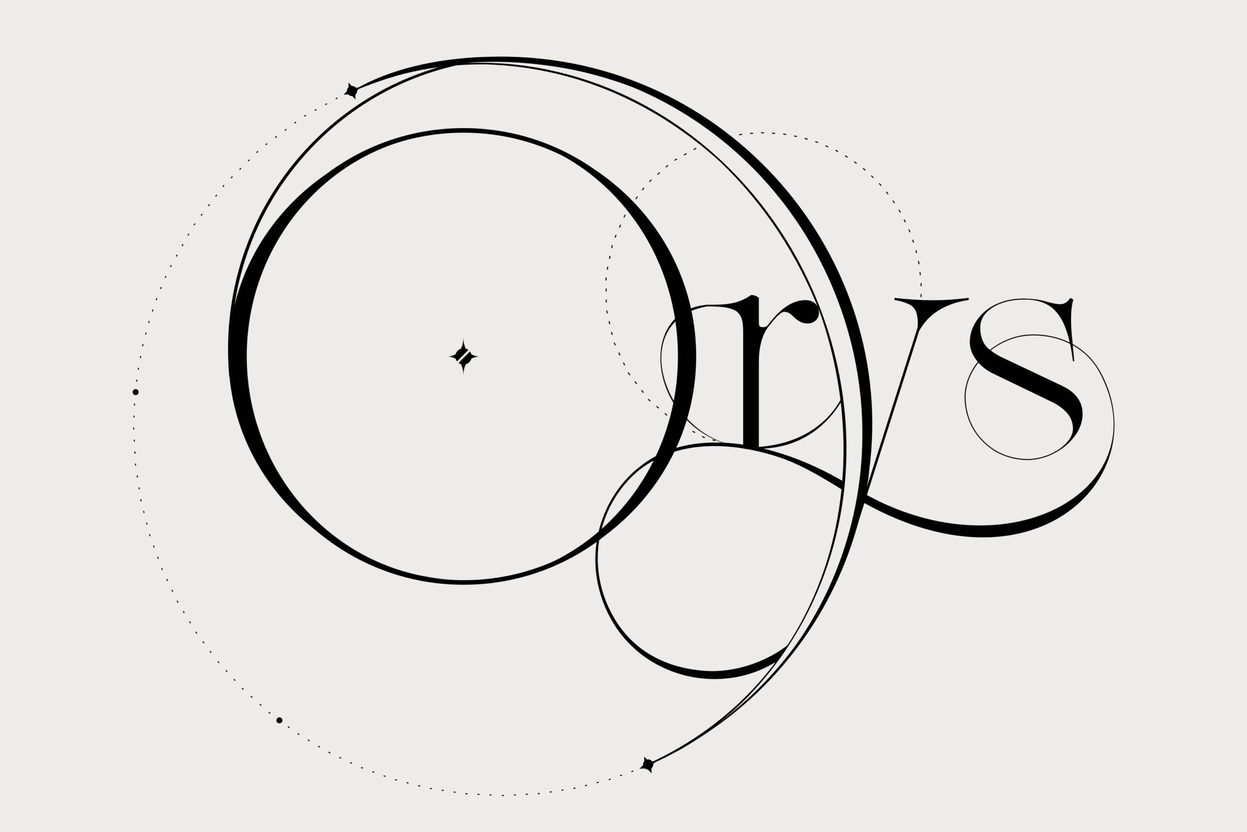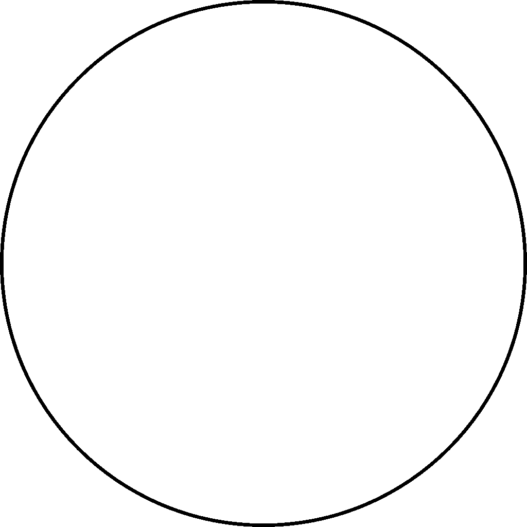
Every brand has a starting point, a spark that sets its entire visual world in motion. For Orys, that spark was a single, perfect circle.
The circle become more than just a shape. It represented the ring world of Orys, and the idea of a universe held together in its endless story. From the beginning, I knew the logo couldn’t just contain a circle, it had to be one. Every element needed to grow from that form, echoing its continuity and symmetry.
Finding Structure
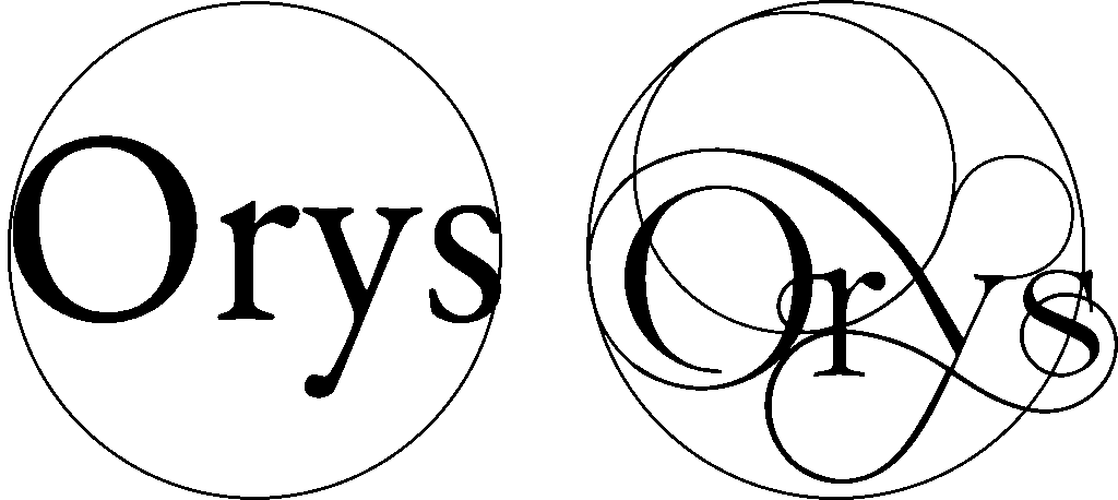
The process began with the “O.” As the first letter of Orys, it naturally formed the outer boundary, a world of its own. From there, I began introducing the letters into its orbit, building a sense of cohesion within the round framework.
This was where the challenge began. Each letter had to respect the geometry of the circle, yet still feel alive and expressive. Small arcs and circular guides began to map invisible orbits between the letters, hinting at something cosmic beneath the surface.
Connection & Infinity
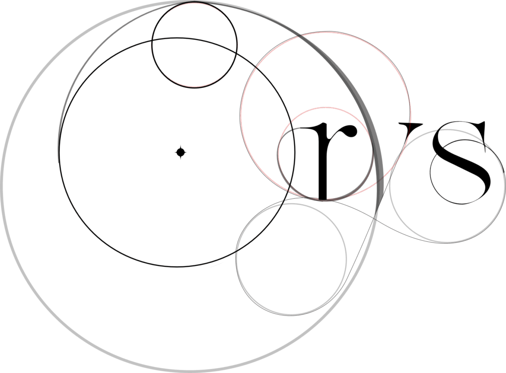
As the letters settled into their circular structure, an infinity symbol emerged, formed by the sweeping motion of the “Y” and “S”, This subtle figure-eight loop became a powerful visual metaphor for Orys, endless, eternal, interconnected.
The design began to feel less like typography and more like a constellation. This sense of cosmic unity gave the logo its soul. It reflected not only the physical shape of the Orys world, but also the interconnectedness of the stories within it.
Refining the Form
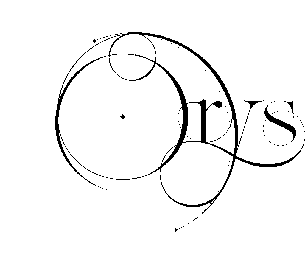
Once the layout felt balanced, I began stripping away the construction lines. Without the scaffolding of circles, the wordmark stood on its own, elegant, fluid, and harmonious. The “O” anchored the design like a planet, while the looping “Y” swept around to embrace the “S” and pull the whole structure together.
From this stage on, the process was all about refinement: smoothing curves, softening edges, and ensuring the flow between letters felt effortless.
Logo Aligned with Stars
In the final design, subtle dotted lines remain as a homage to the original construction circles. They now serve as symbolic stars, aligned with specific points on the Orys calendar. The “Y” arcs like a crescent moon around the “O,” and the letters themselves rest in perfect balance, orbiting one another in perpetual motion.
What began as a simple circle evolved into a mark that carries the spirit of Orys: continuous, connected, and cosmic.
With warm regards,
Alexander N Graham
